Greige: color, colonialism and "quiet luxury"
the fascinating intersection of taste, neutrals and Orientalism
Hi friend,
The world seems dark lately, the news of war and violence wreak havoc on our nervous system and I find myself deregulated often. I had been wanting to share some of my research about color, yet in the midst of such global angst it seems trivial, but we have no other option than to carry on, so here goes… #onward
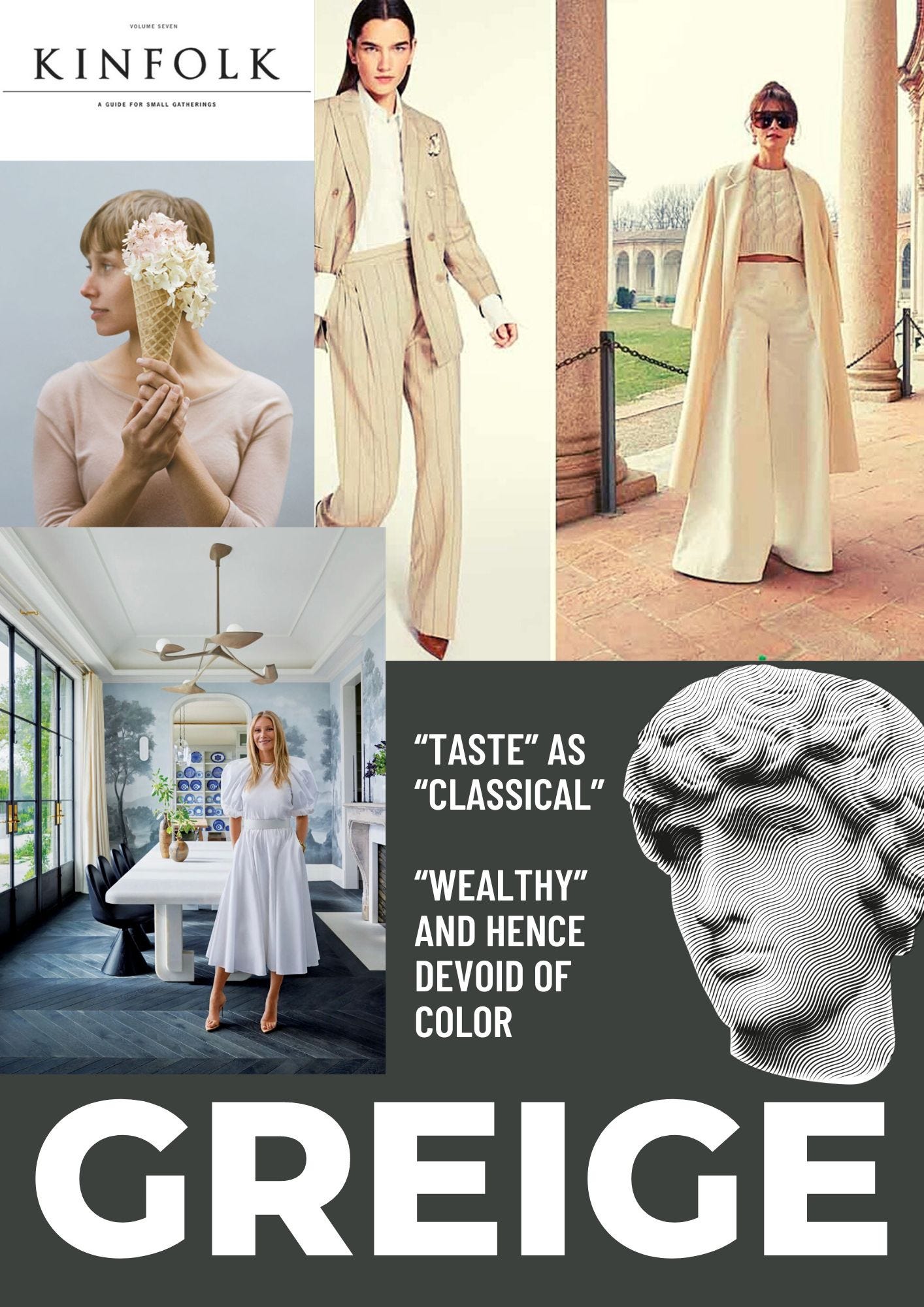
Have you noticed a prevalence of neutrals and the color “greige” (the bland marriage of gray and beige tones) that fill the pages of design magazines like Kinfolk or Magnolia and every product of brands like Eileen Fisher? In the collage above the picture of Gwenyth Paltrow’s very expensive dining room personifies this muted tonal range, the pearl colored ceiling and drapes, the multiple tones of gray on the wallpaper— evoking some pastoral, highly-manicured, British landscape of yesteryear. The whole thing screams 1% wealthy and “elegant.” In terms of fashion trends, if you Google “quiet luxury” (the reigning Western standard of good taste) you get some of the looks I included in the aforementioned collage: a bunch of luxe cashmere sweaters in beige and well-tailored trousers in winter white. Classic, curated, chic, and refined are some of the adjectives surrounding this recent trend, personified by the brat pack siblings in the HBO Max hit Succession. Not surprising the most popular paint tones in 2023 are gray, beige, white and neutral earth tones. Subdued, lighter tones are everywhere, even in our homes: the most popular colors for cars are black and white, and in furniture color it’s (drumroll)… gray. Even my diverse, eclectic Miami neighborhood is slowly transforming into a sea of uniform white boxes with hurricane-impact, black windows, a cement driveway, water-guzzling lawns and clusia hedges, the tropical “gentrification” plant du jour. This is sad on so many fronts, the loss of character, the loss of natural habitat, and more to the point, the loss of color!
Did you know this modern-day chromophobia, a term coined by David Batchelor to describe a fear of color, has deep roots in colonialism!!!
In his seminal book “What Color is the Sacred?” anthropologist Micheal Taussig explores the cultural meaning of color. He explains how “color” became code for the “exotic” other of Non Western countries. He equates color to the Spanish word calor or heat, a visceral, sensorial experience, a far cry from the cold and sterile world of griege.
The introduction of Indian textiles to Europe via the spice trade in the 16th century radically changed the Western concept of color. From the seventeenth century onward, the British East India Company traded not only on spices but also in brightly colored, block-printed, dye-fast cotton textiles from India. When the vibrant pinks and oranges of India, printed on soft cotton, hit the Medieval “market” place people were hooked, I mean imagine the scratchy (and smelly) wool of Northern Europe compared to yummy silk and cotton. Revolutionary.
In Taussig’s aforementioned book he breaks down how color was introduced into the West via imperial trade routes. He traces the West’s innate discomfort with color to its association with “the primitive” -- the non-western other. In one of my all-time favorite quotes Taussig describes “the western experience of Colonialism as colored OTHERNESS.” This is a view he shares with another brilliant scholar, Edward Said.
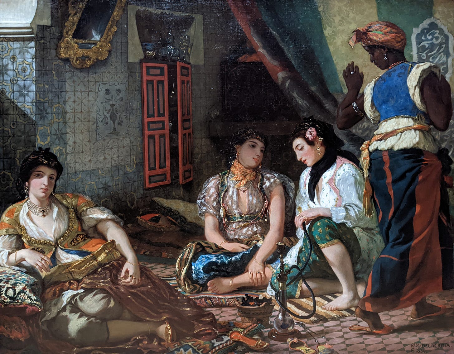
Orientalism as a concept stems from a 1978 book written by Said where he establishes this critical concept to describe the West's prevailing depiction of “The East,” as an exotic, often sexualized, “OTHER.” (This Delacroix painting is a classic XIX example of the Western love/hate relationship towards color.)
But back to Micheal Taussig, who begins his book with this quote by Johann Goethe
“Men in a state of nature, uncivilized nations, children, have a great fondness for colors in their utmost brightness, and especially for yellow-red.”
This idea of the civilized (code for European) is embodied in the contained, pearly white-ish buildings that house most museums and civic buildings around the world. It is a hallmark, a stamp, of colonialism and imperialism. Post 1492, one of the first thing the Spanish Crown mandated to their colonial officials was to level the indigenous temples and erect (very phallic term for very patriarchal institutions btw) the holy trinity: a church, a municipal building and a central plaza. I love this 1992 painting (see below) called “The Meeting” by Ecuadorian artists Jaime Zapata. I cannot imagine more of a disssociative contrast than the “Americas” circa 1492. The grandeur of the ancient cities of the Maya and the Aztec, their leaders clad in colorful feathers, emeralds and gold interacting with the Spanish in their itchy dark wools and clunky steel helmets. The literature from that era is filled with fantastic descriptions of this “strange, new world.” And the goal was to replicate the European “order” in these “strange lands” by subjugating the natives, one instrument was via the use of Classical Greco Roman architecture.
What is ironic is that the white temples and statues that we associate with Antiquity were actually colorfully painted!
“We think of the Greek statues: The Renaissance idea of purity came from misbelieving that the statues were always marble-white. In fact, they painted them. They were so colorful. They were super garish and bright. We misunderstood that, and we created something completely different—something quite destructive, favoring fairness and lightness, in order to satisfy a Biblical narrative of angelic lightness and purity, as opposed to darkness.” - Ocean Vuong
“In fact as this essay elucidates the corrallary between the white figures of Ancient Greece and Rome and 20th century fascism which appropriated these monuments of idealized beauty as symbols of white superiority. Fans of Greco Roman art include Benito Mussolini and Adolf Hitler. According to this article, “for the Nazis, this meant aligning the visual image of the mythical Aryan race with Greek statues, for instance by featuring men with finely sculpted torsos.”
Classical is synonymous with Europe and in the “Fashion” world it is code for “taste,” class and aspirational whiteness a la “quiet luxury.” David Batchelor writes that “in the West, since Antiquity, colour has been systematically marginalized, reviled, diminished, and degraded..This chromophobia, or fear of color, manifests as the valorization of white as the color of rational, clean, controlled spaces, while color is seen as dangerous, superficial, and potentially contaminating.” #thatsocolonial
Minimalism, as evident in contemporary interior design is also associated with refined taste. White cubed galleries are seen as the height of the very exclusionary art world. The brand Goop with its minimal packaging and neutral-toned “basics” like a $600 navy cashmere sweater caters mainly affluent white, middle-aged women with disposable income. You may think this is a stretch but to me this is all very sus, the absence of bright color or print, to me, smacks of colonialism. It is pretty telling that Gwyneth on the cover of her Architectural Digest feature of her “tranquil contemporary home." is clad in… a WHITE dress! It signals “pure” and aspirational because even in religious iconography white is associated with innocence and the Virgin Mary.
Anyway if you have hung on this long thank you, please consider becoming a paid subscriber (starts at $8 per month!) so that I can grow this community, continue my research, and hopefully turn this into a book! The ethos of Substack is for writers to get paid for their work, but if its not possible I will still publish one weekly!
With love always,
xo Vero
Don’t agree with me? Like these idea?? I would love It if you could…


